The City of Brownsville officially adopted the controversial logo that left many city residents fuming after they felt the new logo didn’t represent the city. Most importantly people felt that the logo should of been designed by someone locally as opposed to a marketing company out of Austin. I decided to look at the other city logos from across the Rio Grande Valley and see what everyone thinks.
This is the new logo the City of Brownsville commission agreed to adopt. Supposedly the marketing company that they hired mentioned that the position of the map of Texas and the Letter “V” with the sparks representing the 5 forms of transportation air, land, water, rail, space
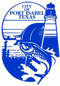
This is the logo for Port Isabel, I think it is an accurate representation of what the city is, like an entry way towards the Gulf of Mexico. You have the iconic lighthouse, a tarpon which is the symbol for the High School team, and the Queen Isabella causeway which leads to South Padre Island and slightly visible fishing boat. The only thing that I don’t like is that it is all one solid color, but other than that I think it is pretty spot on.
The beach umbrellas represent a nice destination to paradise, and quiet honestly it’s good having a little getaway in our own backyard. I can’t say anything negative since when we think South Padre Island, we think relaxation and that is what SPI is.

This is the logo for Los Fresnos. Based on this image, the only thing I can tell is that it’s sunny and there’s lots of palm trees.
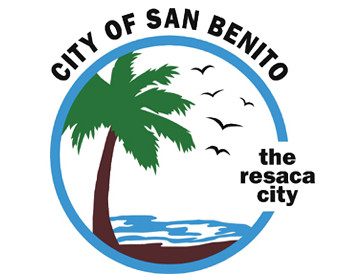
When I see this, if it wasn’t for the wording “The Resaca City” I would think that San Benito was an island. I am not sure if San Benito actually has more resacas than Brownsville though.
The city of Rio Hondo, not sure if it’s a city really because the only thing that is there, is that one old bridge that opens up, but as soon as you pass it, that is it.
Harlingen is kind of the entry point to the valley, at least if you’re coming down Highway 77. There is Raymondville but usually you pass by without knowing it. The logo seems like a freeway wrapping around the letter H, or it could be the main loop that starts from Ed Carey and goes around towards the airport and exits towards Combs.
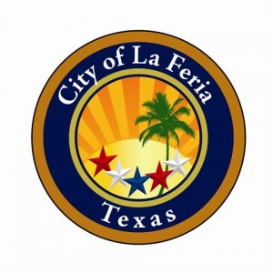
La Feria seems to have a seal of some sorts, with 5 stars going from red,white,blue,red,white, and a nice little palm tree with a nice shiny sun in the background.
This actually is the logo for Raymondville. The slogan says “City with a Smile” which happens to be depicting the giant water tower that actually has a smiley face, but I don’t know it doesn’t really cut it for me and I am not sure if the residents there actually really happy.
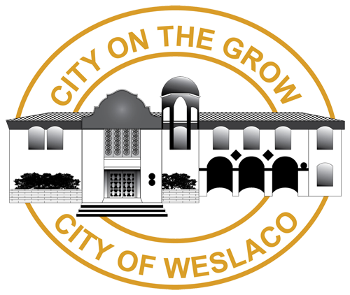
Weslaco is actually a pretty nice city to live in, it’s pretty much at the heart of the Rio Grande Valley, but does this logo actually represent the city? The city is growing as it states, I think I remember reading sometime ago that it had the most growth from all the valley. Whenever I think Weslaco, I think purple for some reason, they do have a really nice high school stadium for the Weslaco High School Panthers, I think maybe they should of incorporated that color instead of the mustard letters.
The City of Mercedes has a crown, not sure what the crown is supposed to convey? King of the Valley? Or Queen of the Valley.
This kind of looks like an intersection of Highway 83 and Interstate 69, or I could be entirely wrong and have to say that I have no idea what it is.
The City of San Juan actually happens to have some sort of modern logo, an arch across the main church that all catholics in the Rio Grande Valley attend time to time, the Church of San Juan. I am not a big fan of the black and white colors though.
The City of Alamo mentions “Refuge to the Valley”. I actually like it, nice green colors, giving you an impression of nice and calm tranquility, with a greenish gradient silhouette of a mission with some sort of bird of prey in the middle, a falcon, hawk?
I don’t know much about this logo, but it just looks like a variation of the letter M. McAllen is a big city, 2nd to that of Brownsville so I am unsure why they didn’t add anything else that symbolizes some portion of the city.
Donna’s message says “The heart of the valley” and I actually like the way the colors are used, kind of like a heart monitor of some sort.
The red,white,blue gradient seems to go with the colors of the Texas Flag or the American Flag, however doesn’t show much other than the person who created it, used Photoshop.
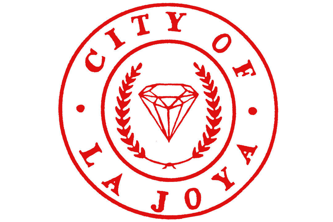
This is a pretty good concept as La Joya in Spanish means “The Jewel” and what else to represent a city than a nice diamond, but let’s be honest the last thing we think of La Joya are diamonds but either way, a good cheeky attempt.
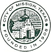
This logo basically has a good representation of the city of Mission, because the only thing that comes to mind, is the Church of Guadalupe Catholic Church.
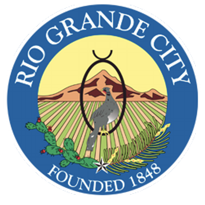
As the city farthest west in the Rio Grande Valley, I actually find this logo fairly accurate. I like the use of colors. I could be wrong, but I think as you get to Rio Grande City, there is a big hill there, not sure if that is one they are depicting in the logo. I like bird in the middle, I would like to say it’s a type of Wild Turkey? a Quail?
So after thinking about it and seeing all the other logos from across the Rio Grande Valley, I think that the one for Brownsville ain’t that bad at all but I don’t think its the best one.
What do I think which is the best and worse logo?
I go with Port Isabel as the best logo that accurately represents the city with the worse logo going to McAllen, although it was a coin toss between Edinburg but chose McAllen for the plain dark blue color. What are you thoughts? Comment below.










Be the first to comment